UX for the Energy Sector: Making Digital Transformation Human-Centered
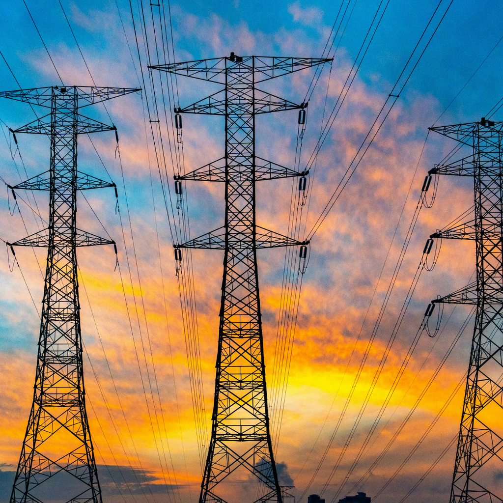
The energy transition is far more than just the expansion of wind and solar power; it is a digital Herculean task. Between complex tariffs, smart meter rollouts, and the customer’s desire for transparency, there is often a significant gap in usability.
But how do you achieve an optimal digital experience in such a technocratic sector? And what role do human-centricity and digital accessibility play?
We asked three industry experts for their insights:
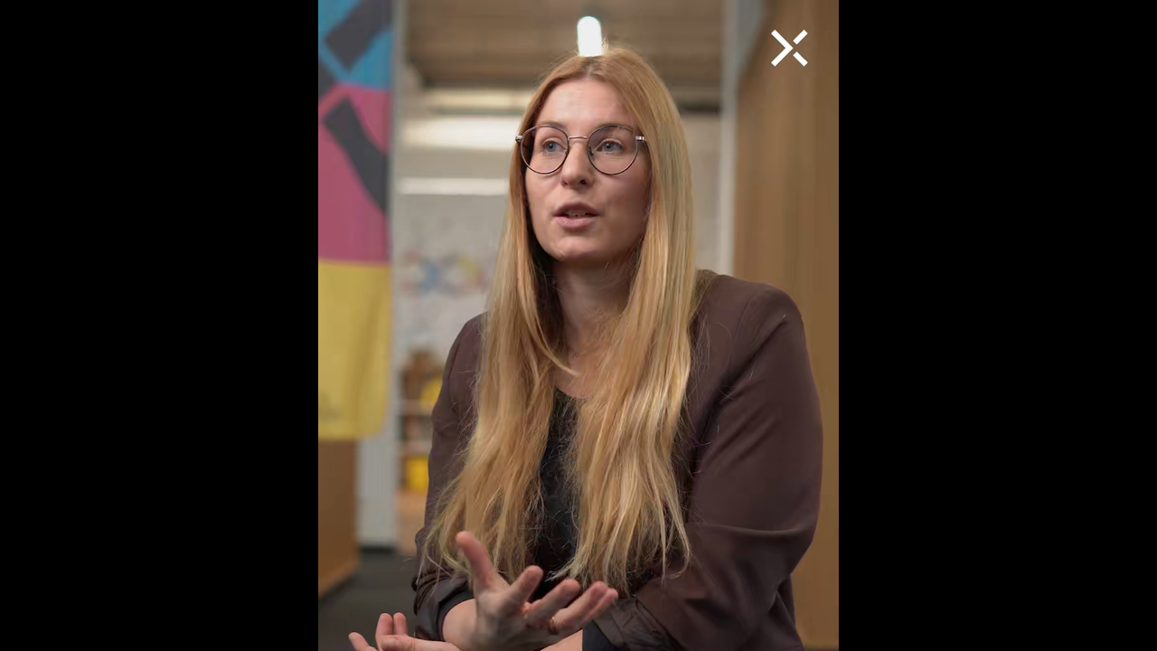
Lena Wirth (Senior Project Manager, Ergosign)
Stefan Kiefer (Lead UX Designer, Ergosign)
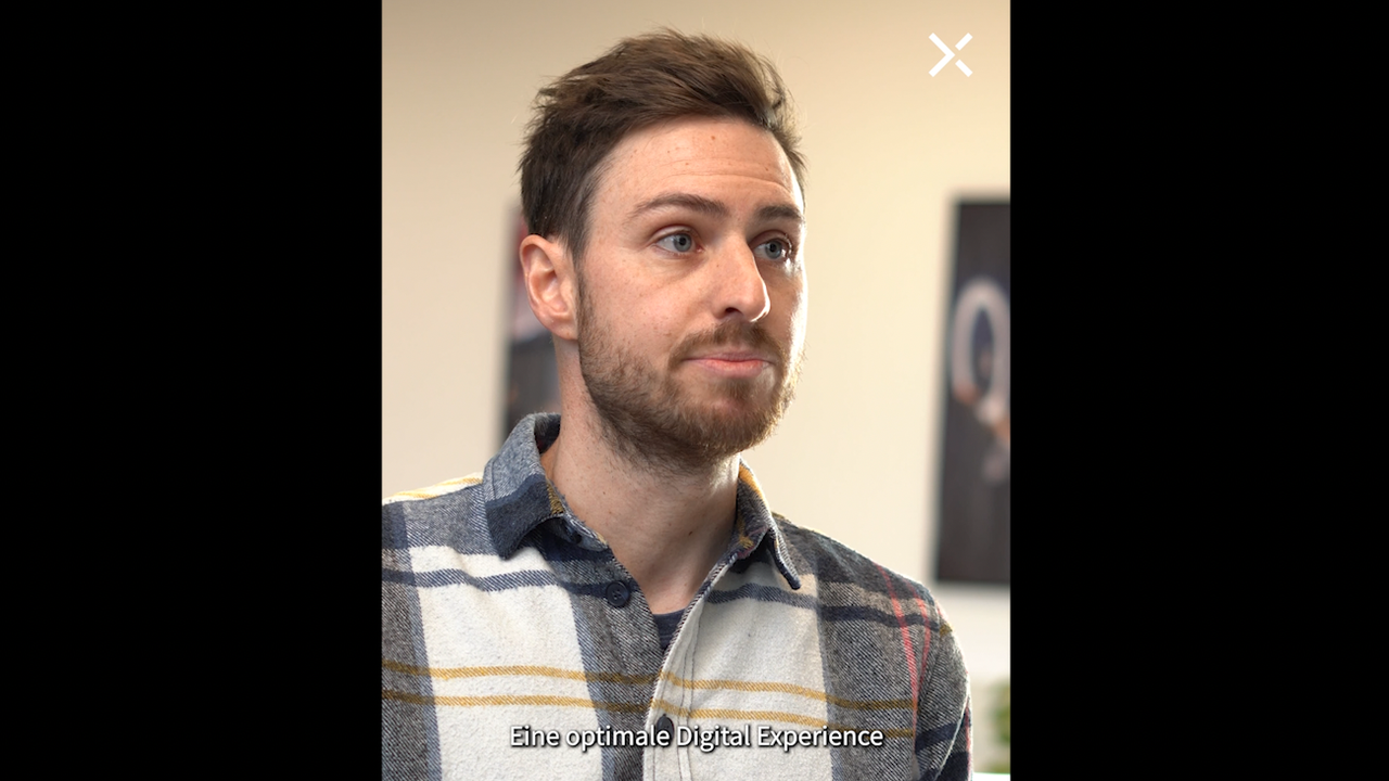
Stefan Mayer (UX Designer, Yippie)
What defines an optimal digital experience (specifically in the energy sector) for you?
Stefan Mayer: For people outside the industry, energy is usually a "low-interest" topic. You don't wake up in the morning and immediately think about switching your electricity tariff. For many, energy is a chore, often associated with uncertainty.
Therefore, DX (Digital Experience) must achieve one thing above all: make complexity invisible to users and make energy-specific topics easy to grasp. An optimal DX respects our customers' time, speaks their language, and gives them the feeling of being in control—even when complex billing logic, market communications, and regulatory requirements are running in the background.
Ideally, people should experience Yippie as a reliable companion in their daily lives: frictionless processes, no nasty surprises, and always the feeling of: "I am in control—and I am being taken seriously," whether on the website or in the customer portal.
What role do Design Systems play in a consistent brand experience—especially in complex energy ecosystems?
Stefan Mayer: For us, Design Systems are the backbone of our brand identity. In the energy sector, we are dealing with an incredibly fragmented ecosystem: the website, customer portal, dynamic tariffs, meter reading, tariff changes, moving house, and much more—plus the Yippie online shop. Everywhere, the customer must immediately recognize: "This is my provider."
Our Design System ensures that Yippie "feels" the same everywhere: it ensures that a button looks and behaves the same way everywhere, and that colors, typography, and tone of voice are consistent. This builds trust. Especially with a product you cannot touch, this visual and interactive promise is crucial.
For development, it also means enormous gains in efficiency: new features can be rolled out faster because the building blocks already exist and have been tested for accessibility.
What does accessibility mean to you personally?
Stefan Mayer: For me personally, accessibility means equality and fairness. These are values that shouldn't even be up for debate. Unfortunately, in the digital space, the topic is still too often perceived as a "tiresome obligation" or a "nice-to-have."
However, once you’ve tried navigating a website using only a keyboard or a screen reader without a monitor, it quickly becomes clear: most websites are barely usable this way. You often hear arguments like, "Yeah... but how many of our users does that actually affect?" Even if it were only a few: Energy is a basic right, and our digital services must be usable for everyone.
When we withhold our services from a (not so insignificant) portion of the population, we are actively contributing to inequality. Ensuring accessibility is about taking a stand.
A11y projects are often marathon sessions. What was the toughest nut to crack—technically, visually, or conceptually—that we tackled together?
Stefan Mayer: The toughest nut to crack was definitely the accessible display and interaction of contract data and functions within the customer portal.
We were dealing with several nested tab menus, each with display modes and interactions specific to the respective tariff type. We had to balance keyboard navigation, screen reader functionality, dynamic headline hierarchies, user-specific colors, and "I-don’t-even-remember-what-else." There were so many interdependent requirements that we went through several rounds of refinement:
Semantic structure: Completely overhauled.
Navigation: Adjusted keyboard focus and reading order.
Technical labels: Defined text alternatives, ARIA attributes, and roles.
Visuals: Optimized color contrasts.
The decisive factor here was our modular concept. It enabled us to tackle this mammoth task by breaking it down into smaller, separate units.
Trust is the most important currency in the energy market. How does excellent, accessible UX directly contribute to brand loyalty at Yippie?
Stefan Mayer: Trust is built through reliability—and accessible UX is the visible proof that we mean business. When a customer notices that we’ve thought of everyone, it signals: "This company cares about people, not just numbers."
Reduced frustration: Leads to fewer cancellations driven by annoyance.
Positive surprises: When something simply works, experiences are shared and recommended.
Inclusion builds community: When people with disabilities have positive experiences, they talk about it—in forums, support groups, and on social media.
In the customer portal especially, where money, contracts, and sensitive data are at stake, a positive experience is incredibly valuable. It pays off long-term in the form of loyalty and referrals. For me, the equation is simple: the less friction and uncertainty our digital touchpoints create, the more Yippie is perceived as a fair, modern, and responsible energy partner.
Energy transition, smart meters, flexible tariffs—we need to adapt our behavior. How can design help break down mental barriers for everyone?
Stefan Mayer: Good design dismantles mental barriers by:
Reducing cognitive split/overload.
Addressing fears through transparent explanations.
Using gamified elements (e.g., small wins, progress indicators).
Allowing for experimentation ("What happens if I adjust my habits like this?") without creating immediate financial risks.
This shifts the mindset from "I don't understand this anyway" to "I’ll give it a try"—and that is exactly the attitude we need for a successful, socially responsible energy transition.
Lastly, a look into the future: Which technologies and services will create the most value for energy solutions in 2026?
Stefan Mayer: From a UX perspective, I see three areas in 2026 that will provide real added value—if they are well-designed and accessible:
AI-Powered Personalization: Not as a buzzword, but in practice—chatbots that actually help. The technology is mature; now it’s about meaningful, accessible integration.
Highly Automated, Transparent Self-Services: Many service requests—from switching contracts to moving house or adjusting installments—can be largely automated.
Intelligent, Personalized Energy Assistants: Based on smart meter data, tariff structures, and individual lifestyle patterns, we can offer concrete, practical suggestions: "If you change these three habits, you’ll save approximately X% without losing comfort." The key will be making this transparent and explainable rather than just providing "black-box" recommendations.
Ultimately, technology is just the foundation. Real value is created only when we consistently design from the user's perspective, explain things clearly, and make them accessible to everyone—regardless of their abilities or devices.